UXR for TDA Connect
Improving a non-profit’s social media portal by gleaning insights from generative and evaluative user research.
Project Overview
Problem: TDA alumni want to stay in touch with their peers after graduation. They don’t feel safe using public social media platforms, and WhatsApp lacks the features to help them sustain long-term connections.
Solution: TDA Connect, a personalized social media web-based app that allows grads to connect with their peers, discover like-minded alumni, and share opportunities for volunteering and work.
My Role: UX Researcher
Team: 8 UX Researchers, 8 UX Designers, 4 Product Strategists
Timeline: 10 weeks, Nov 2022-Jan 2023
Tools: Figma, Figjam, Miro, Maze, G-Suite, Notion
Context
TDA (The Dream Academy) graduates build meaningful connections with their peers as they complete an intensive skill-building program with Safeplace International.
The Dream Academy program supports single mothers and LGBTQIA+ refugees who left their home countries due to discrimination. The program helps members build community, develop professional skills, and reclaim their identities.
Over 1,000 people have graduated from TDA.
Design Process
-
1. Discover
Gain context on SPI organization, product vision, and problem space

-
2. Empathize
Explore what TDA grads need and value in an online community

-
3. Test & Iterate
Refine the design solution through research-backed insights

1. Discover
Users feel deeply connected to the SPI community, have diverse interests, and are concerned with online security.
Goal: Learn about TDA graduates' needs when participating in online communities.
Challenge: We couldn’t reach participants for a few weeks because they were on a break.
Action: Conduct secondary research. Analyze TDA grads’ usage of SPI’s public social media channels and review other products that create safe spaces for LGBTQIA+ people.
Result: Create informed hypotheses about possible user needs, which we later evaluated during research and testing.
KEY ACTIVITIES
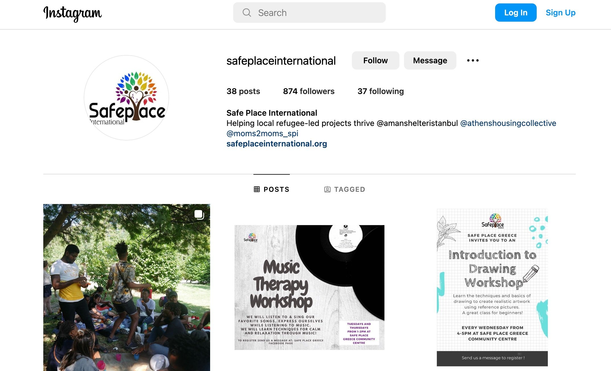
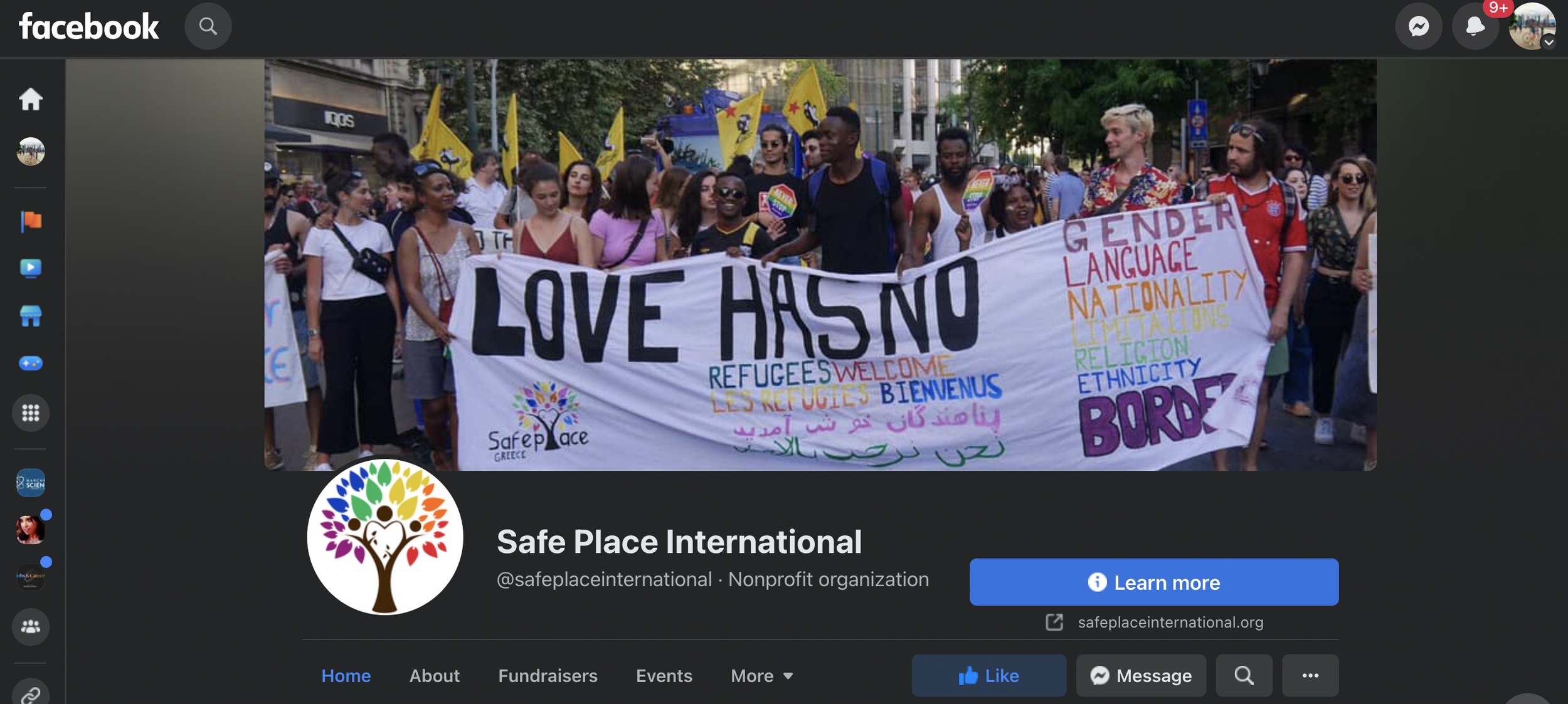
Secondary research of SPI’s public social media accounts and website to better understand the organization and its members.
Competitive analysis & SWOT analysis of six products that create a safe space for LGBTQIA+ communities.
Evaluate preliminary prototype. Review the initial prototype and read documentation to understand design choices, which were made without the benefit of user research.

SPI's instagram page

SPI's facebook page

SPI's twitter page
KEY INSIGHTS
After reviewing how TDA grads interact on SPI’s public social media channels, we crafted hypotheses about what they might need from our design.
Users want to stay in touch based on the feeling of home and safety they cultivate during the program. Posts indicate a deep connection based on interpersonal trust built with like-minded people.
Users need an easy way to find relevant content. Across social media platforms, there’s a wide variety of topics: volunteer sign-ups, job postings, news, events, announcements, activism, fundraisers, accomplishments, location-specific posts, and more.
Users need to personalize profiles to their comfort level. While some users publicly displayed their names, photos, and personal stories, others used avatars and protected personal details.
Users appreciate details that are specific to SPI. The “I love you” sign language emoji is present across all social media platforms. Including this emoji and other details specific to SPI can make the app feel more personal to the community.
2. Empathize
TDA Grads have heightened privacy concerns, face low-bandwidth issues, and want the app to offer practical support.
Goal: Identify TDA grads’ needs and personalize the design solution.
Challenge: Initial prototype was created without the benefit of user research.
Action: Test hypotheses by interviewing TDA graduates and conducting surveys.
Result: Increase app security features, update privacy options, use low-bandwidth considerations, and prioritize the mobile prototype.
KEY ACTIVITIES
Facilitate moderated interviews (7) and launch remote surveys (12 responses)
Update the user persona with data-backed points.
Provide actionable insights to the design team, so prototype is tailored to user needs.
Research Highlights
KEY INSIGHTS
Interview and survey data illuminated the need for practical resources, strong safety measures, and low-bandwidth considerations.
Users want to use this app to maintain relationships, find practical resources, and find jobs. Sustaining relationships and empowering their communities motivate grads to join the app. Research also shows that grads want to use this platform to find and share resources (housing, food, necessities) and job opportunities.
Privacy concerns are heightened due to cyberbullying, discrimination, and doxxing. Research indicates that most users would feel comfortable sharing personal information (name, photo, location) in a private channel. However, some state there’s no online environment where they can truly feel safe.
Users often encounter low-bandwidth internet issues. The app should leverage best practices that support users if they experience low-bandwidth connections.
Users are most likely to access this app on a mobile phone. This is a web-based app that will be available on any device. However, the initial design focused on the desktop version, so learning this led the team to prioritize the mobile design.
3. Test: leverage insights from usability testing to optimize the design for our users
KEY OUTCOMES
Prototype evolution: Initial design → revised Mid-Fidelity design → polished High-Fidelity design
Provide research findings and recommendations to UX Design team; collaborate with client on key design decisions
Documentation of research results stored to clarify design decisions
ACTIVITIES
Design and implement testing, create usability testing script, recruit participants, document results, and analyze findings.
Moderated usability testing round 1: test the preliminary prototype. Present recommendations to design team who implemented strategic revisions.
Moderated usability testing round 2: test the updated prototype. Present findings to design team, who further refined the design.
KEY FINDING: The Report feature was a high priority from the client’s perspective, but testing shows that this feature clashed with users’ mental models.
The client requested that our design include a way for users to report instances of discrimination. The organization would use this data to track issues their members faced.
In the first test, users worried that the report would go to government authorities they did not trust. They would feel safer privately messaging an SPI member. In the second round of testing, users understood that the report would not be disclosed to anyone outside SPI. However, they were only motivated to complete the report if it resulted in a prompt response and support.
SPI does not have the capacity to monitor these reports and provide support immediately. We recommended to de-prioritize or remove this feature, as it’s unlikely that users would use it.
Our Impact
How research informed the final MVP design
-
Research validated users’ interest in a social media platform that is private to the TDA community.
Alumni no longer need to rely on What’sApp to stay in touch. TDA Connect is a private platform that offers common social media features that facilitate meaningful connections.
TDA Connect offers ways to share news on a timeline, chat with others directly, join interest groups, and share events and resources.
-
User research revealed that TDA grads had faced discrimination on public social media platforms. This made some wary of social media, while others only engaged online using an alias.
TDA Connect features multiple layers of security, such as requiring a unique access code for signing up. In addition, when logging in, users must answer security questions to confirm their identity.
We refined the onboarding flow through usability testing to succinctly and clearly convey the safety measures in place.
-
User research led to insights about how we could effectively personalize the app. Through testing, we validated these features and improved them.
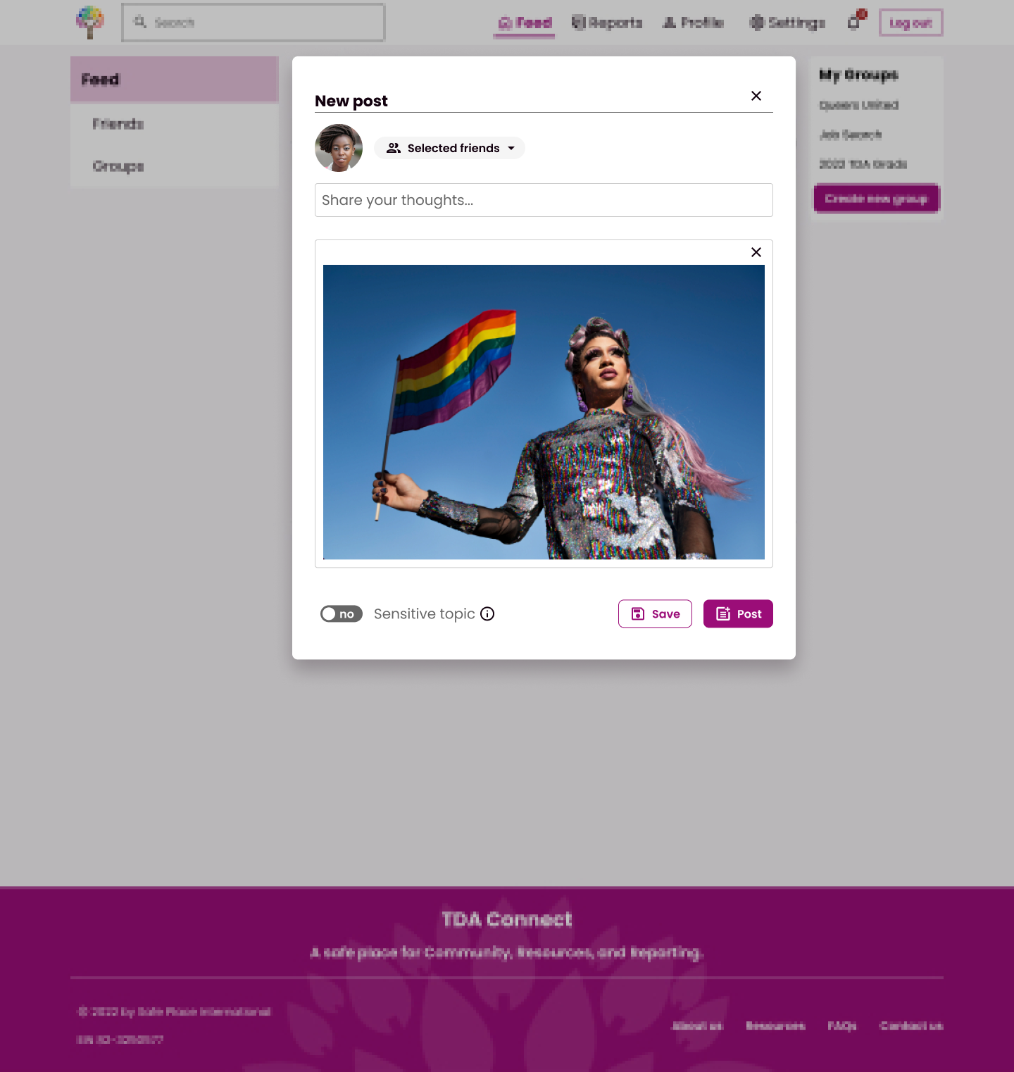
Grads sometimes need to post about sensitive topics. We included a trigger warning feature that they can use on their posts. This warning tags the post topic and hides the post content. That way, users can decide if they feel up to reading about that topic.
Over 1000 people have graduated from TDA, and research revealed that graduates don’t all know each other. While they generally trust the community, they want control over whom they interact with.
We created a “friend“ feature, so users can choose who is in their network. They can add a graduation year banner to their profile, which makes it easier to find alumni from the same year.
Users can post publicly (to the entire community) or to their friends (people they have chosen to add).

The home page emphasizes connection by highlighting users' posts.

Users can view each other's profiles and connect through a friend request.

Users can add a trigger warning on their post, and they can choose if the post is public or just for their friends.

Users can personalize their privacy settings, so that sensitive information is only available to those they trust.
What did you learn?
Prepare a test script that allows flexibility during each session.
We planned an hour with each participant, but issues with wifi and logistics cut time from nearly every session. I couldn’t reach all components of the test for each participant. However, I was prepared for this and gained meaningful data from each session!
While our script was lean and focused, we highlighted the most crucial areas before the test. We agreed that some questions could be skipped and some tasks could be condensed if there was a time crunch. Despite logistical challenges, this strategy allowed me to gain valuable data from every session.
What would you change?
I would allot more time to conduct the unmoderated usability test.
I helped design an unmoderated usability test on Maze to evaluate areas of the prototype that weren’t covered in the moderated test. Only two participants completed the test on Maze, so there wasn’t enough data to draw insights from.
Our condensed timeline likely limited the number of participants we received. The moderated usability tests were more of a priority, so the unmoderated test was squeezed into the time we had left over. Next time, I would design these tests simultaneously so there’s enough time to conduct both styles of usability testing.
What was successful?
Careful documentation and good communication made it easier to navigate unexpected personnel changes.
About halfway through the project, our point person from SPI changed. As our team began working with a new member from SPI, we leaned on our documentation to make the transition smooth. By this point, we had already refined a prototype and conducted research and testing. That’s a lot to catch someone up on! We highlighted essential decisions, such as what led us to prioritize some features over others.
In addition to leveraging documentation, we restructured meetings to leave more space for Q&A during check-in time. We couldn’t assume that the new point person was up to speed on everything, so creating this space for building context was essential.


